Rezerv's Website of the Month: State of Fluidity
State of Fluidity’s website is a prime example of what can be achieved with Rezerv’s website builder. By taking advantage of Rezerv’s intuitive tools and customization options, they’ve crafted a seamless, engaging, and professional online presence that truly reflects their brand and caters to their clients' needs.
Welcome to the inaugural edition of Rezerv’s 'Website of the Month' series! Where we celebrate the creativity and innovation of our clients who use Rezerv’s fitness management software to build outstanding websites for their fitness businesses.
At Rezerv, we totally get how important it is to have a killer online presence, especially if you're running a fitness business. That's why we've put our heart and soul into designing a super easy-to-use website builder that requires zero coding skills. Yup, you read that right—no coding needed! Why? Because we know you’d rather spend time growing your business and connecting with your community than wrestling with complicated tech.
In this series, we will highlight one exceptional client each month who has utilized our built-in website builder to create a functional, beautiful, and engaging online platform. Through their stories, we aim to showcase the diverse ways our clients are leveraging Rezerv’s features to enhance their business operations, attract new clients, and foster a thriving community.
This month, we are thrilled to spotlight State of Fluidity, a yoga and Pilates studio in Sabah, Malaysia that has truly exemplified the power of a well-designed website. By seamlessly integrating our booking system, membership management, class schedules, and more, they have created a user-friendly and visually appealing online space that reflects their brand and meets the needs of their clients.
One thing we absolutely love about our website builder, and we’ll sure you'll appreciate it too, is how darn easy it is to whip up a website that looks good on any device. Mobile-responsive design? Check.
That means whether your visitors are on a desktop during a lunch break, scrolling through a tablet on their commute, or tapping on their phones while on the treadmill, your website is going to look fantastic and function perfectly. Because let’s face it, we’re all glued to our phones these days, so having a site that looks great and works well on any device is a must!
In this article, we will take an in-depth look at the website created by State of Fluidity, highlighting the key features and design elements that make it unique. We will explore how they utilized Rezerv’s website builder to achieve their vision, the ease of use, customization options, and the powerful tools that helped them build a professional and engaging online presence.
We will also discuss how the mobile-responsive design has enhanced their user experience, making it easy for clients to access their services from any device. So join us as we explore the impressive website of State of Fluidity and discover how Rezerv’s website builder can transform your fitness business.
Client spotlight: State of Fluidity (Sof Studios)
This month, we're super excited to feature State of Fluidity, also known as Sof Studios, in our "Web of the Month" series. Sof Studios is a Yoga and Pilates studio located right in the heart of Kota Kinabalu, Sabah. They’re all about helping you get into the mental state of being fully immersed in becoming your best self, which they call the "State of Fluidity."
Sof Studios believes that being strong is for everyone. They offer a wide range of Yoga and Pilates classes, using top-notch equipment, well-trained instructors, and even infrared heating. Their goal is to create a welcoming environment where you can invest in your health alongside like-minded individuals.
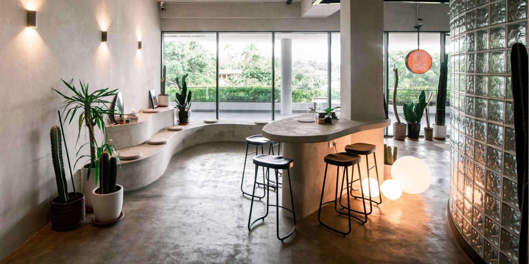
Source: Sof Studios
About Sof Studios
Founded by passionate Sabahans, Sof Studios is committed to providing a safe community for self-improvement. They believe in the values of community over competition, kindness, self-love and love for others, respect, and non-discrimination. This ethos is reflected in every aspect of their studio, from their class offerings to their interactions with clients.
Located in the Golden Triangle of Kota Kinabalu, Sof Studios is strategically placed next to all your daily errands, making it convenient for clients to incorporate wellness into their busy schedules. Visit them at Jesselton Twin Towers and experience the vibrant community they have built.
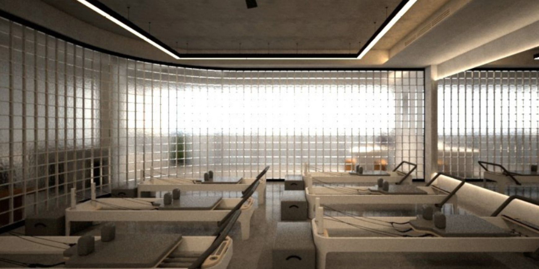
Source: Sof Studios
Class offerings
Sof Studios offers a variety of classes to suit all fitness levels:
- Power Reformer: A full-body workout focusing on strength, welcoming all levels, including beginners.
- Power Plus Reformer: A challenging, spicy full-body workout designed to make you feel the burn and the shakes.
- Sculpt Mat Pilates: A dynamic workout on the mat, using props and infrared heat to enhance your exercise experience.
- Chill Yoga: A gentle, mindful 60-minute yoga flow incorporating foundational movements and strengthening elements.
- Strong Yoga: A fiery 60-minute yoga flow focusing on strengthening poses, combining dynamic movements for a robust workout.
- Yin Yoga: A rejuvenating 60-minute yoga session where poses are held for 3 to 5 minutes to promote deep release and relaxation.
- Private Group Mat: A customizable mat class for up to 15 friends, perfect for a shared fitness experience.
- Private Group Reformer: A reformer class for up to 8 friends, offering a personalized group workout session.
Creating a seamless online experience
When Sof Studios set out to build their website, they knew it needed to be as inviting and functional as their studio. Using Rezerv’s easy-to-use website builder, they created a site that looks fantastic and works seamlessly. Their new website showcases all their classes, making it easy for clients to view schedules, book sessions, and purchase memberships or packages.
In the next sections, we’ll delve deeper into the specific features and design elements of Sof Studios’ website. We’ll explore how they utilized Rezerv’s website builder to create a site that’s as engaging and effective as their in-studio experience.
Website highlights
Leveraging Rezerv’s powerful website builder, Sof Studios has created a site that is not only visually stunning but also highly functional and user-friendly. Let’s take a closer look at some of the key features and design elements that make their website stand out.
Design elements
The design of the website, powered by the Rezerv Alpha Theme, is both aesthetically pleasing and functional. Key design elements include:
- Primary color: The primary color used throughout the website is light gray, creating a calm and professional aesthetic that is easy on the eyes.
- Header font: The headers are styled using San Francisco Bold, giving a modern and bold look that commands attention.
- Body font: The body text is set in Montserrat Regular, ensuring readability and a clean, contemporary feel.
- Text color: The text color is black, which provides a clear and strong contrast against the light gray background, enhancing readability and overall design.
- Aesthetic appeal: The consistent use of professional images with a cohesive filter across all images maintains the website's high aesthetic standards and keeps visitors engaged.
Homepage section
The homepage serves as a vibrant and engaging entry point for visitors, showcasing the full range of offerings and the unique ethos of the business. Here’s a detailed review of each section of the homepage:
1. Hero banner
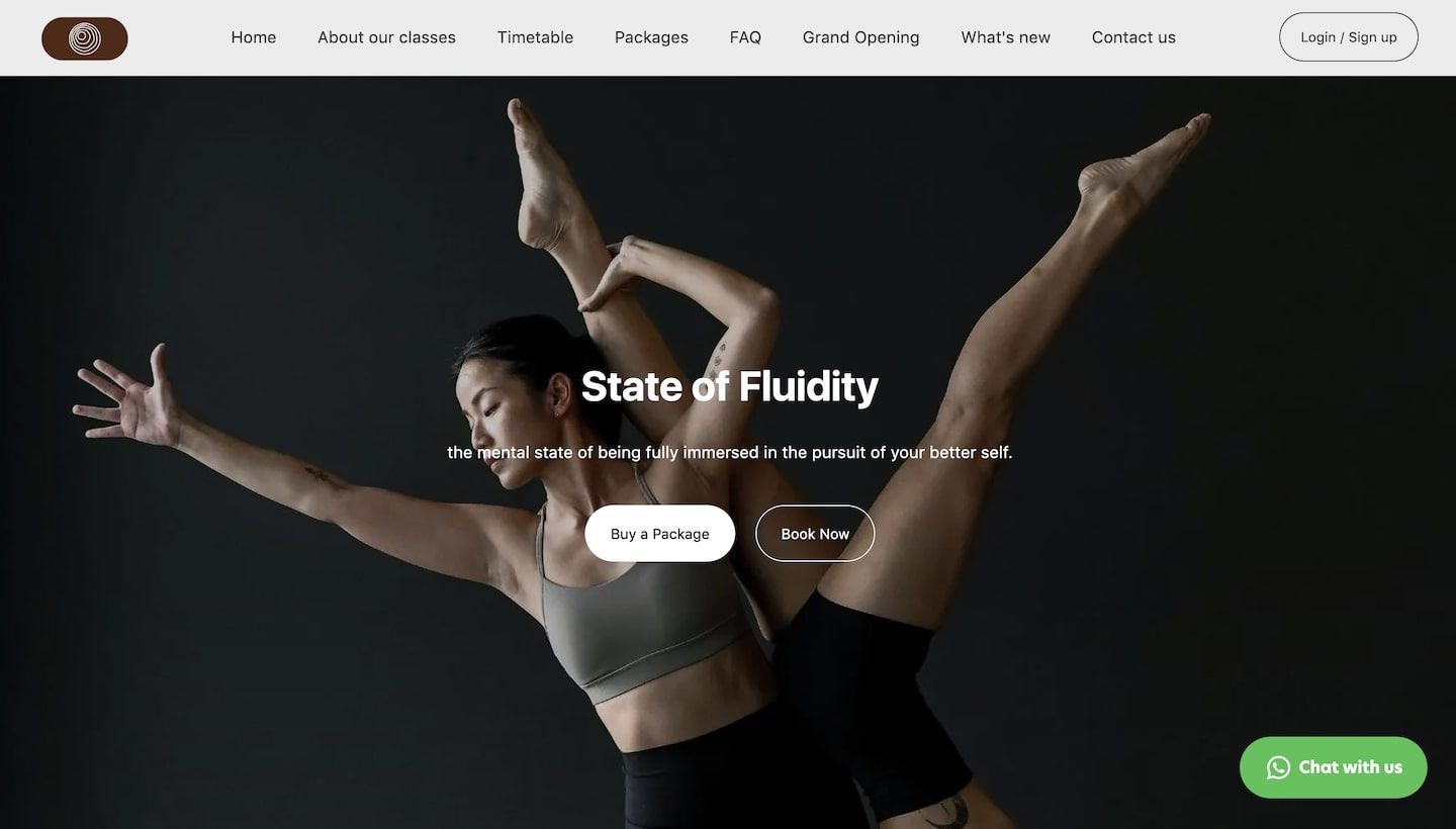
- Visual impact: The hero banner uses a single, high-quality image rather than a dynamic image or video. This choice provides a consistent and strong visual impact, conveying the essence of the brand with clarity and focus.
- Header title and description: The business "State of Fluidity" and the subtext "the mental state of being fully immersed in the pursuit of your better self" effectively communicate the studio's mission and invite visitors to embark on their fitness journey.
- Call-to-Action (CTA) Buttons: Prominently placed CTA buttons, "Buy a Package" and "Book Now," are designed to drive immediate action, making it easy for visitors to engage with the studio’s offerings right from the start.
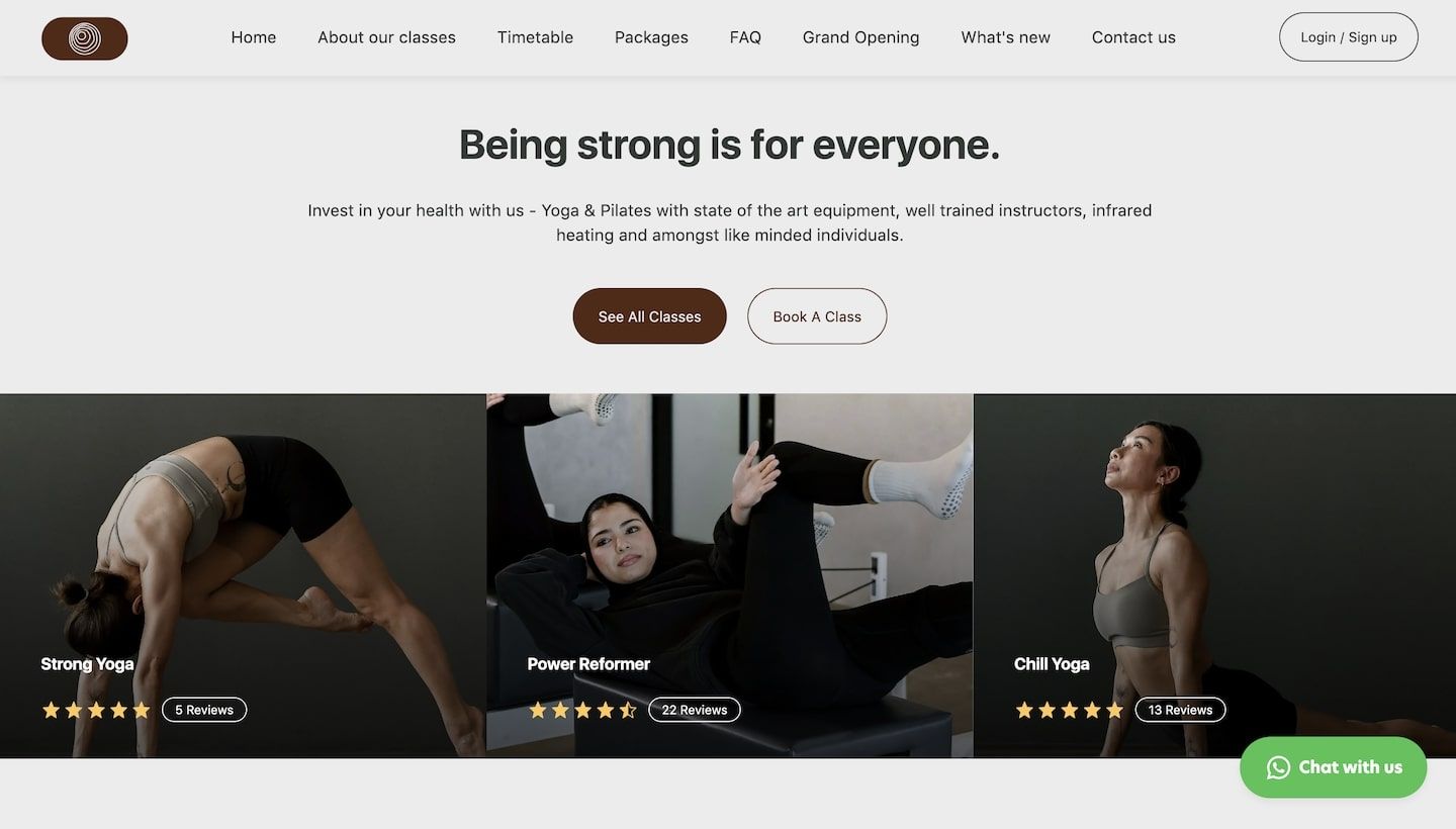
2. ‘Class’ section
Notably, the website skips the traditional standalone CTA banner, opting instead to integrate call-to-action elements directly within the classes section. This approach keeps the user experience smooth and focused, guiding visitors seamlessly from inspiration to action.
3. ‘About us’ section
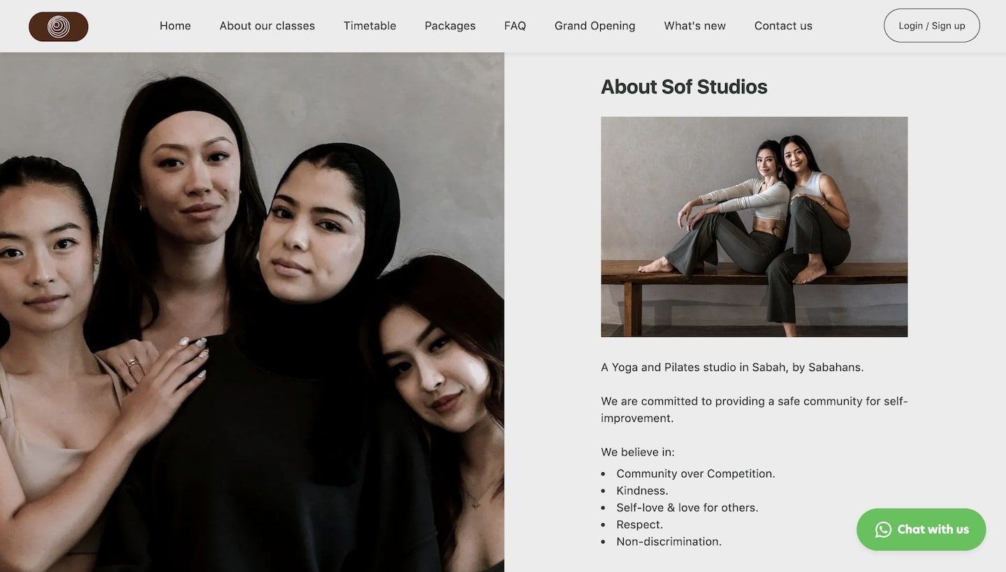
- Personal touch: A warm, inviting photo of the team adds a personal element, making the studio feel approachable and community-focused.
- Studio mission and values: A short introduction about the studio’s mission and core values (e.g., community over competition, self-love) communicates the ethos of the business and connects with visitors on a deeper level.
- Engagement element: The playful prompt "Are you a softer?" with a button "Yes I am" encourages visitors to identify with the community and engage further.
- Featured image in description: The "About Us" section also includes a featured image within the ‘Description’ part, adding a visual element that complements the text.
4. Visual gallery
The visual gallery cleverly repurposes the skipped CTA banner, turning it into an engaging showcase of the studio’s environment and activities. The images have been carefully edited to blend seamlessly with the overall website design, maintaining visual consistency and harmony.
5. Location Information
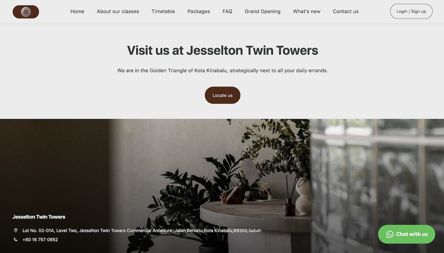
Clear and concise information about the studio's location at Jesselton Twin Towers is provided, along with an inviting call to action "Locate us."
Custom pages
When it comes to building a website with Rezerv, you’ve got two main types of pages to work with: system pages and custom pages. System pages are kind of like the backbone of your site. They’re the built-in pages that handle all the essential functions your business needs.
Think of your homepage, location details, timetable, membership info, and all the booking and appointment stuff. These pages are pre-configured to ensure seamless integration with Rezerv’s comprehensive booking and management features, making it easy for you to manage everything without much fuss.
But what if you want to get creative and add something unique to your site? That’s where custom pages come in. Custom pages give you the freedom to create whatever content you need, tailored specifically to your business. You can design these pages from scratch and fill them with any information you think is important.
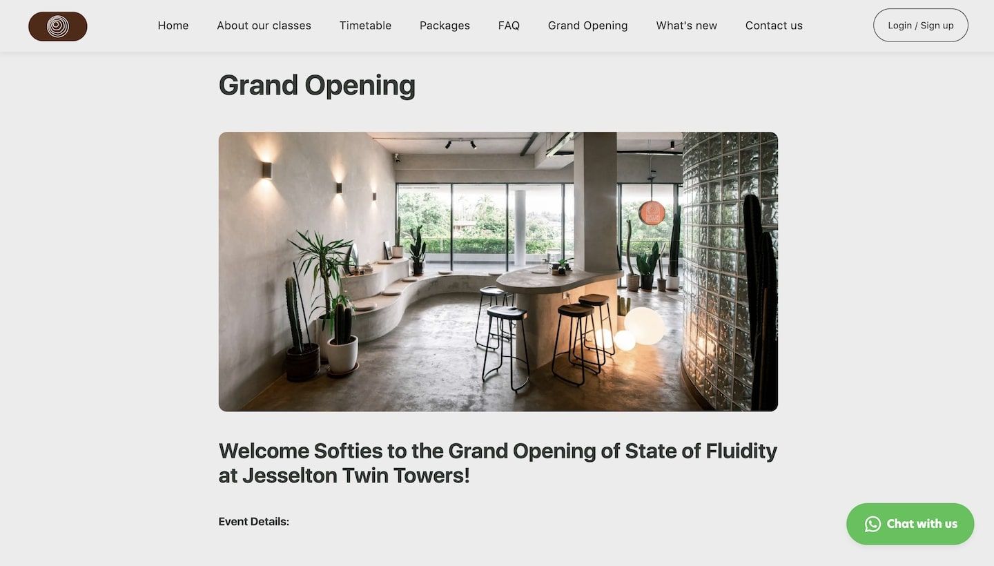
State of Fluidity has adeptly utilized the custom pages feature in Rezerv to create a dedicated page for their grand opening event. It's a fantastic way to showcase their event and ensure that everyone has all the info they need in one place. This custom page is a prime example of how businesses can leverage this flexibility to enhance their online presence and engage their audience.
So, if you’re using Rezerv website builder and want to add some personal touches to your site, don’t hesitate to dive into custom pages. They’re a powerful tool to help you connect with your audience and make your website truly yours.
Blog pages
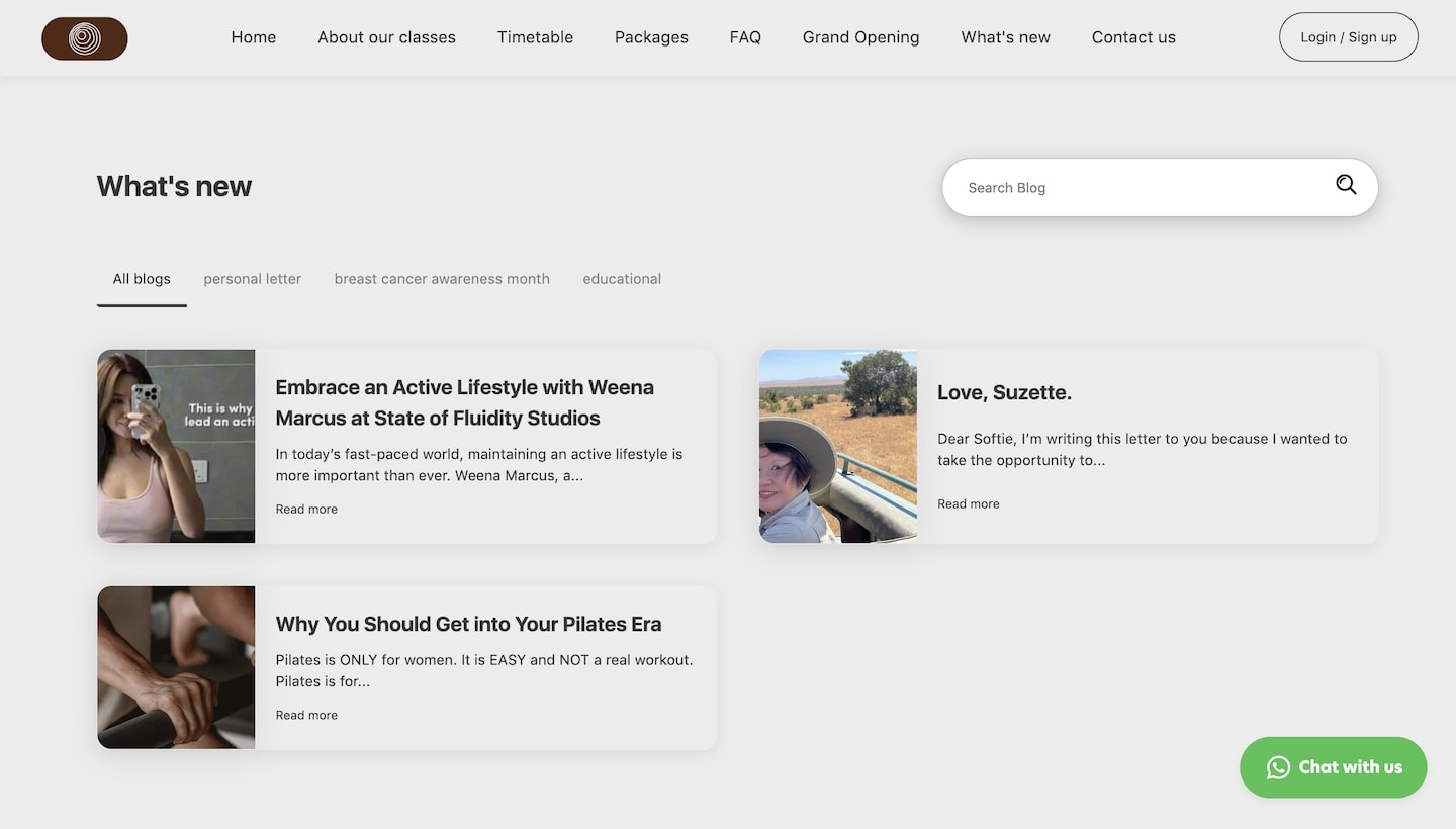
State of Fluidity has smartly renamed their blog section to "What's New," transforming it into a dynamic space where they share the latest news about their studios, educational tips, along with customer reviews and testimonials. This not only keeps the content relevant and interesting but also helps build a sense of community among their audience.
With Rezerv’s built-in blog post builder, creating and managing blog content is a breeze. This tool allows users to effortlessly craft, edit, and publish posts directly from the platform. You can add images, format text, and organize your posts to ensure they’re both visually appealing and informative. This makes it easy to share updates, insights, and stories with your audience, keeping them informed and engaged.
FAQ section
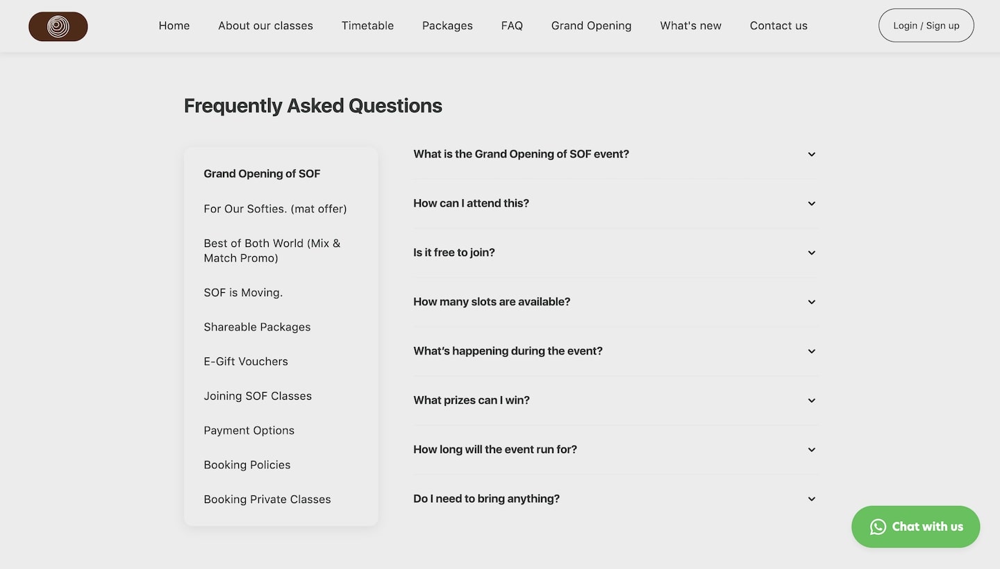
Setting up an FAQ section in Rezerv is a game-changer for keeping your visitors informed. It’s all about making things easy to find and understand. You can break down your FAQs into different topics and then fill each topic with questions and answers that cover everything your customers might need to know.
At State of Fluidity, the FAQ section is thoughtfully arranged into distinct topics such as "Grand Opening of SOF," "For Our Softies," "Best of Both World (Mix & Match Promo)," and more. This structure helps visitors navigate directly to the information they are interested in without having to sift through unrelated content.
Let’s take the "Grand Opening of SOF" topic as an example. It’s packed with questions you’re probably already asking yourself, like “What is the Grand Opening of SOF event?” or “How can I attend this?” Each question has a clear, straightforward answer. So, if you’re wondering if it’s free to join or how long the event will run, the answers are right there, easy to find.
The beauty of this system is how user-friendly it is. You just click on a question, and boom, the answer drops down right below. It’s a smooth experience that saves you time and hassle. Plus, it means fewer people need to reach out directly because they can find what they need on their own.
By organizing the FAQ section with relevant topics and concise, clear answers, you’re not just giving visitors a good experience – you’re also building trust. People appreciate when they can quickly find the info they need. It shows you’re thinking about their needs and respecting their time.
SEO settings
SEO settings in Rezerv website builder are crucial for boosting your pages visibility on search engines. Let's break down the key components of these settings and see how State of Fluidity leverages them to optimize their site.
URL slug
The URL slug is the part of the URL that comes after the domain name. Rezerv makes it simple to customize this slug so it’s clear and descriptive, benefiting both search engines and users. For example, State of Fluidity uses straightforward slugs like "/class" to clearly indicate the purpose of the page.
Page title
The page title is one of the most important elements for SEO. In Rezerv, you can craft a concise and descriptive title that appears as the clickable headline in search engine results. State of Fluidity’s homepage title, "State of Fluidity | Yoga & Pilates," is a great example. It clearly defines what the business is about, which helps attract more clicks and improves search engine ranking.
Description
The description field is where you provide a brief summary of the page content. This snippet shows up below the page title in search results, so it needs to be compelling and informative.
For instance, State of Fluidity’s homepage description, "Yoga and Pilates studio in Kota Kinabalu, Sabah. Offering beginner to intermediate classes for Sabahans by Sabahans," gives a clear and inviting snapshot of what they offer.
Social sharing image
Adding a social sharing image is optional but it’s highly recommended. This image appears when the page link is shared on social media platforms. By uploading a visually appealing and relevant image, State of Fluidity can increase engagement and click-through rates. It’s a small touch that makes a big difference in how their content is perceived and shared across social networks.
Hide page from search results
Rezerv also offers an option to hide pages from search results. This feature is useful for pages still under construction or not intended for public visibility. However, for most public-facing pages, like homepage, you’ll want to keep this option turned off to ensure they are indexed by search engines.
Custom domain
Rezerv website builders also have the ability to connect your own custom domain, giving your website a professional and personalized touch. If you don’t have a domain from a third party, Rezerv provides a default domain that ends with .rezerv.co. However, having your own custom domain can significantly enhance your brand's presence online.
For example, State of Fluidity has their own domain, making their website URL www.sofstudios.co. This custom domain helps them create a more professional appearance and makes it easier for clients to find and remember their website.
State of Fluidity’s website is a prime example of what can be achieved with Rezerv’s website builder. By taking advantage of Rezerv’s intuitive tools and customization options, they’ve crafted a seamless, engaging, and professional online presence that truly reflects their brand and caters to their clients' needs.
The successful implementation of Rezerv’s website builder at State of Fluidity underscores the importance of having user-friendly, robust, customizable fitness management software for fitness businesses. They’ve shown that with the right tools, creating a beautiful and functional website that drives business growth and enhances client engagement is not only possible but also straightforward and easy.
If you’re inspired by State of Fluidity’s website and are ready to transform your own fitness business’s online presence, we’re here to help. Book a demo today and discover how Rezerv can empower you to create a stunning, efficient, and user-friendly website that will take your business to the next level.
Let’s build something amazing together!
